
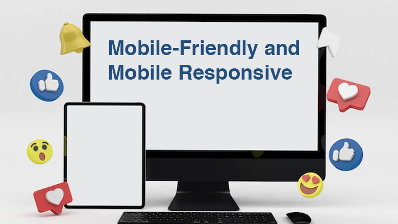
Difference Between Mobile-Friendly and Mobile Responsive

Nowadays, Mobile-friendly has surpassed desktop, creating a major opportunity for users/visitors to capture more revenue. The majority of people are using smartphones for any kind of information they need. Google has taken mobility into an account as a ranking factor to make your website mobile-friendly.
Have you ever been confused about what is Mobile-friendly and responsive design? Here is the detailed article to let you know the difference between mobile-friendly and mobile responsive design.
What is Mobile-Friendly and Mobile Responsive?
Mobile-Friendly:
A mobile-friendly website is designed to display your site on mobile that works exactly in the same way across devices. It doesn’t change anything except the scale of your site features like navigation, menu, dropdowns are limited. (Generally, it changes depending upon the devices).
Mobile-friendly application (or) websites lead towards a good user experience because the mobile-optimized website content could be accessed easily and readable.
Mobile Responsive Definition:
Responsive design allows visitors to navigate your website easily. No matter whatever the device is. It provides a better user experience to your website because they could get the information anywhere and anytime. If your website not responsive Google will penalize for providing a bad mobile experience.
Note: Though you have a well-designed website, If your page is not responsive and mobile-friendly on smartphones you cannot rank higher on SERP (Search engine results page).
Difference between Mobile-Friendly and Responsive design
The below table shows the key difference between mobile-friendly and responsive design.
| Mobile-Friendly | Responsive Design |
| 1. Static content that doesn’t change | 1. Dynamic content that changes |
| 2. Navigation is simplified | 2. Navigation is condensed |
| 3. Images display smaller | 3. Optimized images |
| 4. Not relevant on a mobile and operating system to function properly. | 4. Relevant on a mobile and operating system to function properly |
| 5. Correct spacing and padding |
How to check your website responsive test?
After converting your website into a mobile device it is better to check whether your website has optimized for mobile-friendly. Google has a friendly website tester called Webmaster tool
You just need to enter your website URL. Below is an example image for a mobile-friendly website and a non-mobile friendly website.
Conclusion:
It is important to make your mobile-friendly with responsive design because consumers are using smartphones for any kind of information to shop online, search for products or services, etc..,
A Mobile-friendly website and responsive pages both on desktop and mobile devices are to improve your ranking on SERP.
- Why Your Educational Institute Needs Digital Marketing?
- Digital Marketing Strategies for Food Industry
- Boost Your Transportation Business and Logistics Companies
- Google Gemini: Transforming Digital Marketing and Shaping the Future of AI Technology
- 7 Reasons Why Doctors Need to Have an Online Presence